
Posters are common in the sciences and social sciences, but arts and humanities scholars and students aren’t usually taught to make them. That’s because in the humanities, arguments aren’t supposed to be reducible to short summaries with illustrations and figures. And in the arts reducing creative activity to illustrations and summaries can seem inappropriate. But some conference opportunities in our fields, like CUR’s Posters on the Hill, require posters. And thinking visually about arguments is a valuable skill no matter what. When it comes time to create a poster in the arts and humanities, what your colleagues in other disciplines know can help you.
What’s the point?
A poster has three main purposes:
- To illustrate your project as you describe it to listeners when you are present
- To provide a basic introduction to your work when you are not present
- To spark interest in your project and make viewers want to learn more
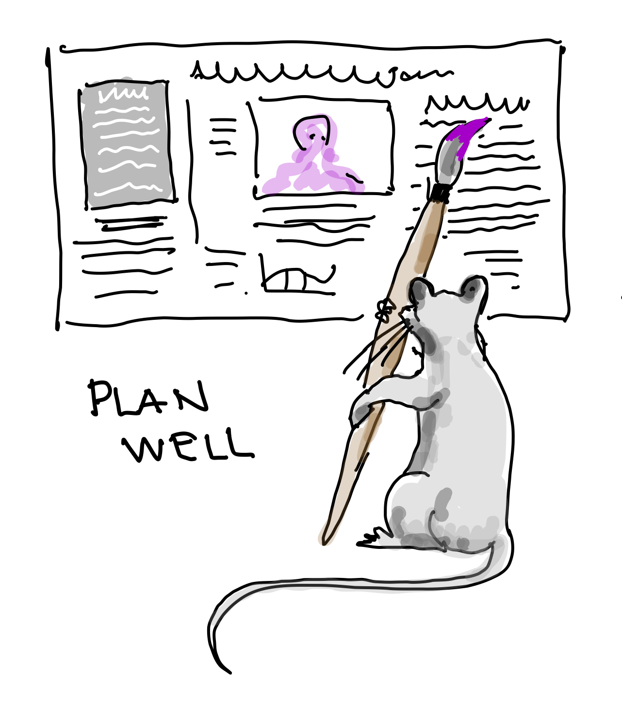
Planning your poster
Posters benefit from planning. Think about your “take home message” and how best you can develop that both textually and visually. You don’t need to cram the whole project onto the poster – distill your message.
Incorporate the visual in your planning from the beginning. Make a list of potential images. For some projects this is easy; the best images are ones that directly advance your argument. For other text-heavy projects you may need to stretch your imagination.
- Images of title pages or manuscripts can be helpful, though they may just present as more text.
- Historical images may work simply as background illustration, even if your argument is not deeply historicized.
- A text box with a dark background counts as a visual element.
- Pulled quotes (short quotations run in large font) can count as visual elements.
- Head shots of important people or even of key collaborators can be useful, but don’t use your own headshot for obvious reasons.
- Avoid the infamous “grip and grin” in which a group of people smile at the camera while holding some kind of trophy or other reward.
Finally, sketch out your poster to explore different options. It’s hard to think big or creatively if you are already pouring text into boxes.
Laying out your poster
Any word processing or layout program will work, but most people use PowerPoint or Adobe Illustrator. Create a single slide or page, custom sized to the dimensions you desire (the “typical” research poster is 48”x36”, but a smaller format is fine – down to about 36”x24”) Print shops can print any size, but some conferences have size specifications.
Here’s what you’ll need.
- A Title
Keep it short and attention getting. Avoid jargon. Your poster title doesn’t need to be the same as a paper or project title. Don’t go full-on clickbait, but your title is one of the main things that will determine whether people stop to experience your poster. - Author name(s), affiliations; advisor name
It may be embarrassing to see your name in large type under your title, but that’s where it belongs. - Introduction
Condense your central idea or question into one or two sentences. - Abstract
A somewhat longer (around 200 word) version — Check out our advice on creating abstracts. - Methods
What you did (or are doing) - Conclusion
What you’ve learned, what remains to be learned - Images and graphics
Don’t forget to caption your images and cite them. - Bibliography
This should just be a super short “read more” bibliography: 4-5 sources max.
Tips on design and rhetoric
Like the pirate’s code, this is more a set of guidelines, but it wouldn’t hurt to make it into a checklist.
- Make one image clearly dominant. That means making it bigger than think you should.
- A few large images is better than many smaller ones.
- Use a consistent palette of color and font over all elements.
This doesn’t mean that everything needs to be in the same font, but similar elements (text, headings, captions, etc.) should be in the same font, size, and color. Consider using a dark-but-not-actually-black color for text. On a poster such color choices can relieve the eye. - Choose a sans-serif font inside any shaded boxes. Outside boxes, use a serif font font for text (your titles can be either).
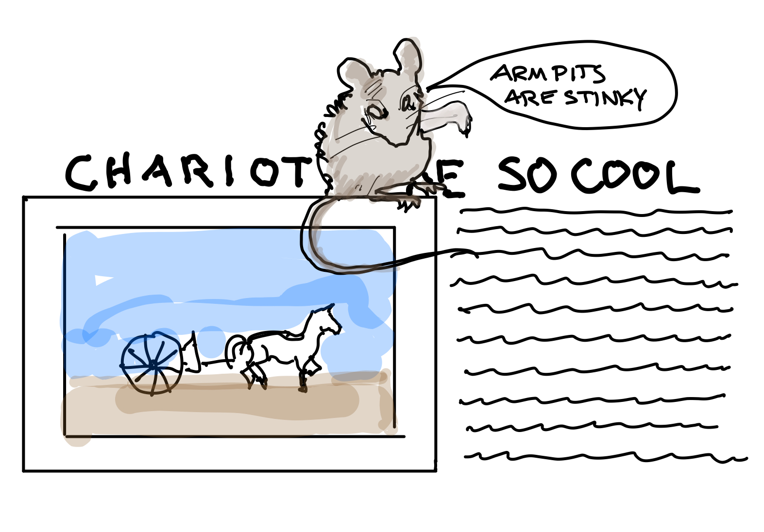
- Don’t separate your titles from your text with images. Use the old newspaper editor’s mantra: “photo-caption-headline-text.” Do not violate this order… except that NOTHING should come between your poster title and the top of the poster.
- Avoid the dreaded “armpit,” when a title runs partly over an image and partly over text.
- Use accessible language; define any specialist terms (you could bold the “vocabulary” words).
- Use publication-quality images (300 dpi minimum); make sure to view your poster at 100% to check for pixellation.
- Consider adding a QR code to your poster and linking it to a webpage with more information.
QR codes may seem like a thing of the past, but they are still a handy way for someone with a smart phone to avoid having to type in a website address. You can make one using this tool. Does this mean you should have a web page? Yes, yes it does! Stay tuned for our handy guide to creating a web portal to your work. - Proof repeatedly, with special attention to captions and headlines, a major source of typos. Read everything aloud, sentence by sentence, backward.
Printing your poster
Convert the final product to a pdf to be printed on poster-grade paper. Don’t try to print on a stiff surface such as foamcore – it’s expensive and unwieldy. Most campuses have printing services that can produce your poster for a fraction of the cost of having it done at a commercial shop, so ask around. Also, many departments have a special budget line just for printing, so consider asking whether you can charge your poster to an account. Posters are expensive. You shouldn’t have to pay for them!
Traveling with your poster
Posters are large and awkward items, but usually you need to travel with them, often on airplanes! Your completed poster may not be fine art iteself, but you should treat it with tender care. Never ever fold your poster. Roll it. Once you do, it’s time to borrow one of those black plastic transport tubes from a friend in the sciences. Don’t buy one or you’ll lose that annoying air of vague superiority we humanities scholars and artists so treasure. Enjoy it while you have it, though. Traveling with a poster tube will make people think you are some big time architect.
Presenting your poster
At a conference, you will be given an allotted time for your poster. Don’t leave it alone during that allotted time. It’s your baby, and you wouldn’t leave a baby alone, right? And don’t stand in front of your poster, because then nobody will see it. Stand next to it.
Make friendly eye-contact with passers-by.
If, like most of us, you’re not an extrovert, now’s the time to fake it. You want people know you’re the poster’s author, not some shifty stranger you left in charge of your baby. And you want to pull their attention to your work. Be aware that you may sometimes get auditors who are there simply because you made eye-contact and they don’t want to treat you like a panhandler.
Dress appropriately
Appropriate dress ranges from business casual to business formal, depending on the event. If the only “formal” wear you have is your party clothing, look for other options. Some day soon you’ll need professional wear for other reasons, like interviews!
Have some talking points prepared, but also solicit questions from your viewers.
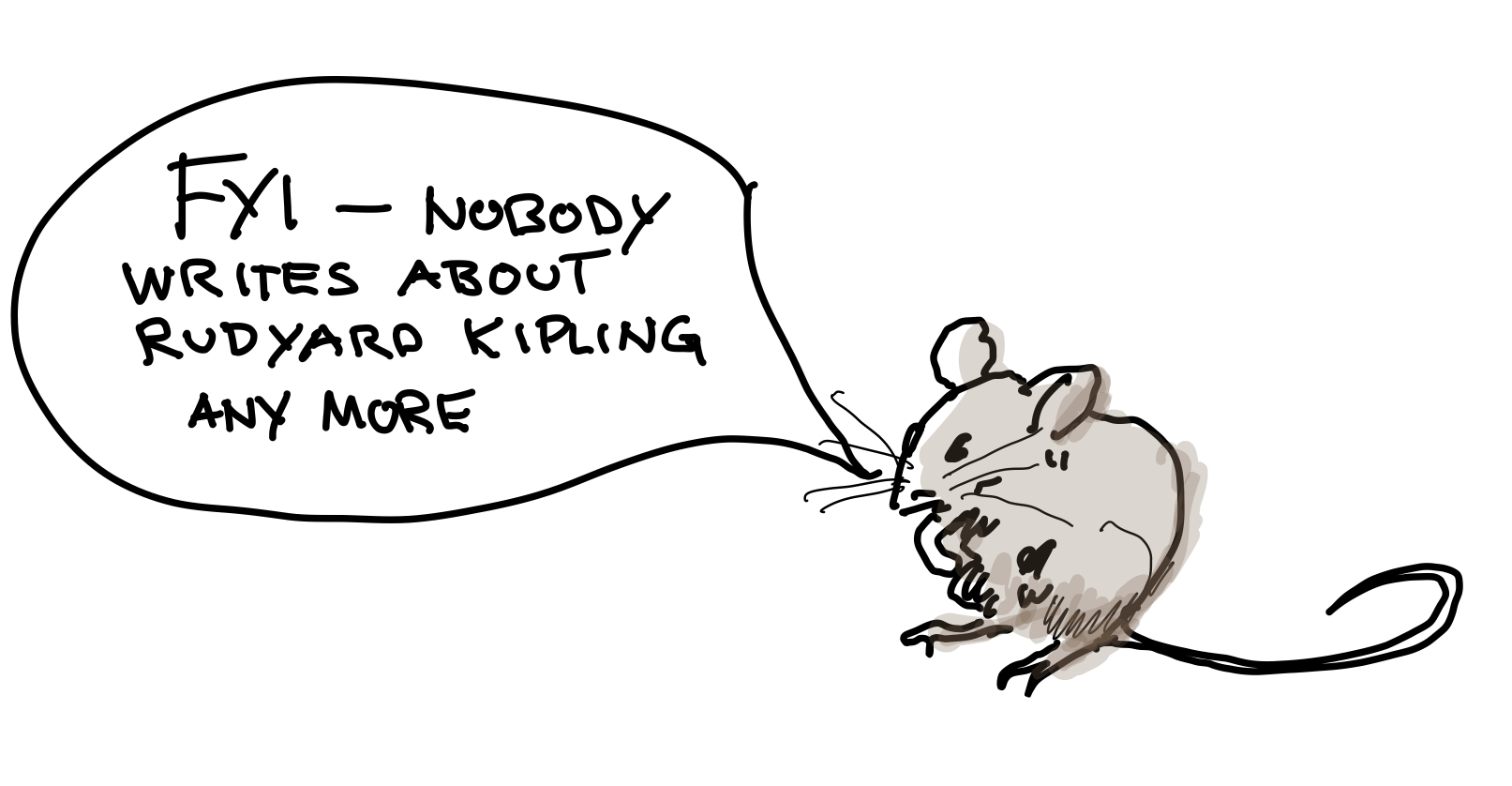
A good lead question from you is “Hi, how much do you know about (insert topic of your poster)?” This is a good way of getting your viewer to demonstrate their interest in your work. It’s also a sneaky way of deciding how complex to make your talking points. If the answer to “Do you know anything about Kipling?” is “I’m the world’s authority on colonial and post-colonial fiction” you’re going to have different things to say than if the answer is “I don’t know; I’ve never kippled.”
Have business cards or a information sheets to hand out, so that if someone is really interested they can follow up.
Don’t force it on people, though!
Check out these other guides from CURAH you might like:
- How to write an abstract
- How to write a proposal
- A list of regional and national conferences where you can present your work
![]() This work is licensed under a Creative Commons Attribution-NonCommercial-ShareAlike 4.0 International License
This work is licensed under a Creative Commons Attribution-NonCommercial-ShareAlike 4.0 International License