By ALEXA SAND
Poster sessions have not been a big part of how the humanities communicates research and scholarship, but they should be. Poster sessions are much more inclusive than panels and help shape the future of the discipline in ways that panels cannot. With their less structured format, their casual, chatty atmosphere, and their emphasis on a wide variety of research and creative work as opposed to a narrow focus, they provide many more opportunities for discussion, idea-generation, and networking than does a traditional panel format. Here are some considerations for those who want to organize a poster session either at a conference or at their home institution.
Space
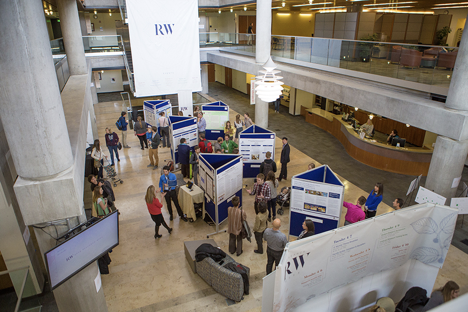
The space for a poster session should be large enough to accommodate people moving about amongst posters, with some elbow room. As a general rule, each 3’x4’ poster needs about 2’ to either side and 6’ in front to accommodate the people who stop in front of it to interact with the presenter or presenters.  Otherwise, things start to feel really crowded, which is detrimental to the conviviality of these events. It’s hard to network or even be heard when crowded in elbow-to-elbow. On the other hand, too much space, and the posters (or more to the point, their presenters) will feel very lonely and isolated. Acoustics are often an issue – look for a space, ideally, that has some sound dampening (though the majority of sessions I have attended have been in high-ceilinged, hard-floored spaces that really get noisy). Light is also a factor. If there is not enough light (natural or artificial), it can be very hard to see the posters!
Time
Like space, poster sessions vary in length. A very large session, with 40-50 posters, might last as long as 75 minutes, but a smaller session could be as short as 30 minutes, enough time for visitors to get their fill of all the posters that interest them and to talk to the presenters of the posters they find most compelling. An important thing to keep in mind is that it takes a bit of time to set up and take down posters, so between 10 and 15 minutes should be budgeted for that, again depending on the size of the session. It will take longer for presenters in a very large session to find their place and get set up, less time for smaller numbers.
Furniture
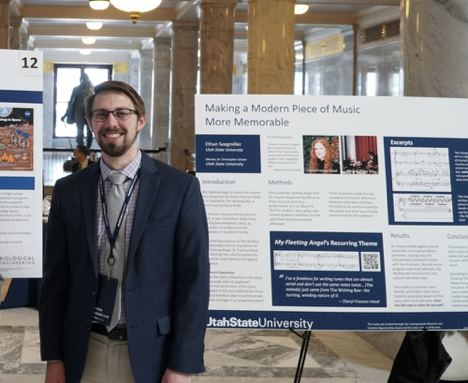
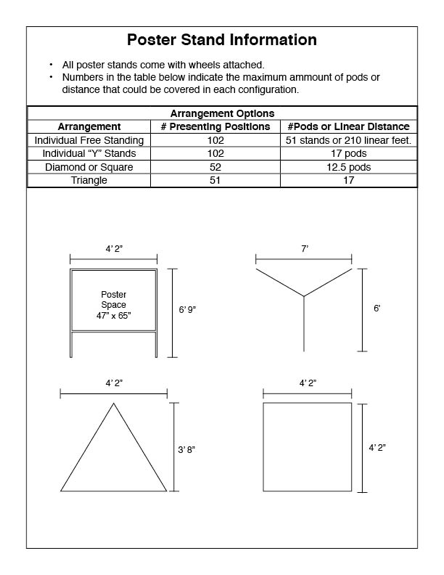
The standard research poster is 3’x4’ in landscape format. Of the several different ways posters can be displayed, probably the most common and least expensive is on easels, with a foam-core backing to support the paper of the poster, and 4 large binder or easel clips to fix the poster in place.  Alternatively, large bulletin boards or moveable walls covered in felt or carpet can be used. In this case you’ll want t-pins (at least 4 to a poster) to affix posters without punching holes in them. If you’re organizing a conference that includes poster sessions, make sure to work with your service providers on what furniture they have – any hotel or conference center will have hosted trade shows and STEM conferences that regularly use this format for presentations, and most universities also own the necessary equipment. There is often an additional fee for moving and setting up both easels and walls, and sometimes there is also a rental fee.
Layout
Depending on the space and furniture, you can organize your layout in a number of different patterns. While nice, straight rows are certainly the easiest deployment of walls or easels, consider setting them into groupings of three or four in “islands” with the backs of the posters together: this allows each presenter to have a little “amphitheater” of space for their audience, and also keeps people moving less in lockstep and more like shoals of fish.  Whatever layout you choose, make sure to create a map before the session and assign each presenter a numbered station (you will need little numbered cards to place in the assigned spots). Create a numbered list with presenter, title, and other relevant information such as department or institutional affiliation, both to help the presenters find their places and to help visitors navigate the session.
Assessment
Some poster sessions just happen, and when they’re over, they’re over. This can be a bit of a letdown for student participants and doesn’t provide organizers with any way to quantify or talk about the quality of the event. Designating a reasonable number of people as “respondents” can be a good idea. Assign these people 3-5 presenters to interact with and give them a clipboard, a pencil, and a rubric or a set of adaptable questions. This way, every presenter gets at least two or three interactions with visitors. You can collect the respondents’ rubrics and give their most helpful comments back to the participants, if you want to take this to the next level. At our annual student research symposium, we have a fairly sophisticated system for collecting assessments of student presentations, which uses a survey-software platform so that we can track data over the long term, but even a simple, paper form can be useful. Students really respond well to the feedback element, because they are in this as learners.
All this is to say nothing of the pragmatics and theory of what makes a good poster, what makes a good poster for the arts and/or humanities, or how to stand in front of a poster and present. These are each big topics in and of themselves. I highly encourage anyone just getting into the business of poster sessions to watch this video by Mike Morrison, a graduate student in psychology at the University of Michigan who has some fun and fairly radical ideas about how to use posters to communicate, but who also gets both the potential and the potential (indeed common) pitfalls of communicating research (or, I would argue creative activity) through a poster.


Excellent advice, particularly for those of us in the humanities not as accustomed to poster sessions, but which are a welcome complement to papers and panels.